Intro text, WYSIWYG field
You can enter text and embed images inline with text. There are header styles in this field, but no separate title field.
There is a wide gap below this element before the next element. Too much?
Jump to Bottom Content Elements
MAIN CONTENT - Intro text [TABLE EXAMPLE 1]
header column | Header Row - 500px width; center align |
---|---|
header column 2 | default border (none). Default cell spacing/width |
header column 3 | seeing what happens with the table text alignment compared to the header column alignment (Table cell text alignment doesn't always behave as expected) |
- This is a bulleted list.
- This is the second item.
- When I indent, I get a letter.
- Another indent, still a letter.
- When I indent, I get a letter.
Palate cleansing text.
- Now let's try regular bullets.
- Default is orange square.
- Second level
- third level
- Second level
Palate cleansing text.
- Going back to numbers but using Start at 3. (doesn't look like it did, though)
Palate cleansing text.
-
These are the fancy bullet styles. This one is List with arrows.
-
You have to selected regular bulleted list FIRST.
-
Then you can use the special bullet styles in the drop-down above it in the formatting toolbar.
-
Also, in edit mode, the bullet sometimes appears on the line ABOVE the text, but when you publish, it displays correctly. WYSIAWYG (I'm adding in an ALMOST)
Palate cleansing text.
- This one is the second option List with arrows (but then it cuts off so I'm figuring out what it does. :D
- Doesn't look like it gave me arrows, though, so may need to fix in future. Arrows as bullets will be going away in Summer 2024 anyway.
- Last bullet of this type.
Palate cleansing text.
-
Third bullet type: List One Column
-
Second bullet.
Palate cleansing text.
-
Fourth bullet type: Also says List one column.
-
SEcond bullet.
[last content in intro text]
Body, WYSIWYG field
You can enter text and embed images inline with text. There are header styles in this field, but no separate title field.
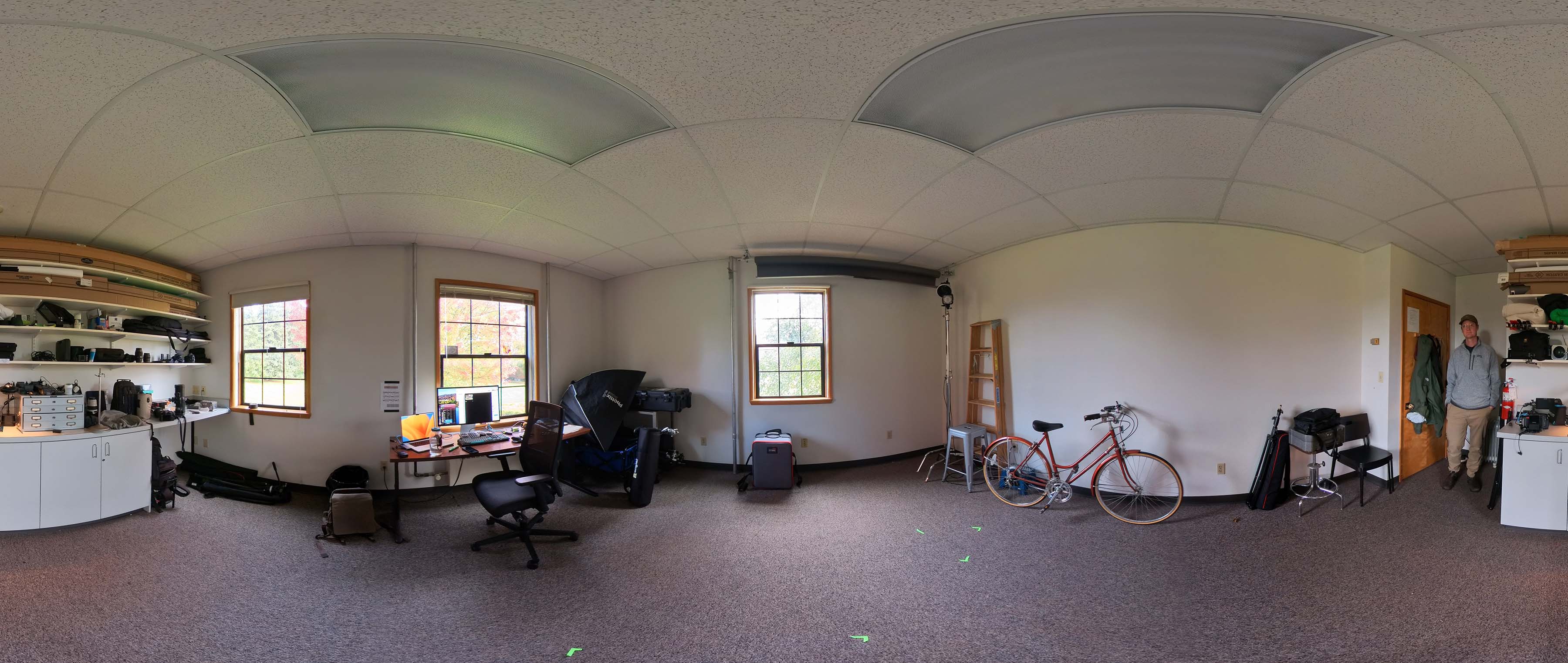
TEST 360 PhotoSphere image (upload and insert inline image, then change its appearance by selecting PhotoSphere from the size display options menu). Note: this image type currently only works in this MAIN CONTENT Body field (link to bottom content test https://www.pugetsound.edu/sample-elements-page-title-unformatted#bottom360image)
Testing a second copy of the 360 image
MAIN CONTENT - Body [TABLE EXAMPLE 2]
header column | Header Row - 100% width; LeFT align |
---|---|
header column 2 | default border (none). Default cell spacing/width |
header column 3 | seeing what happens with the table text alignment compared to the header column alignment (Table cell text alignment doesn't always behave as expected) |
...
h2 entered all lower case
h3 entered all lower case
h4 entered all lower case
h5 entered all lower case
h6 entered all lower case
[last content in body wysiwyg]
Top Content Column Callouts (Title, unformatted)
Body, WYSIWYG field
You can enter text and embed images inline with text. This example is in the Top Content section, formatted to take less page width to sit next to a right-side callout.
Body, WYSIWYG field
You can enter text and embed images inline with text. This example is in the Top Content section, formatted to take less page width to sit next to a right-side callout.
WYSIWYG (Title, unformatted)
Textarea, WYSIWYG field
You can enter text and embed images inline with text. This example is in the Top Content section, formatted to take less page width to sit next to a right-side callout.
This is an option of the Column Layout section. Can choose the options in any left/right option. Options include Image with Caption, WYSIWYG, and Quote elements.
Seems too narrow to use this in Top Content. May want to have KWALL remove from Top Content options.
Column Callouts (3)
Body, WYSIWYG
Body, WYSIWYG
WYSIWYG Title (unformatted)
Textarea, WYSIWYG, Top Content so changes size when sidebar callout added.
The video embed above is also in the Top Content, and the accordion above is reusable paragraph from the library. Note: Can only add reusable elements allowed in that section and on that page type.
Checking what happens to text when have a lot of text in the WYSIWYG in the Top Content area. Want to make sure where it wraps. Images embedded in this section woudl also fall in these same boundaries. Using Top Content elements, even when they fall below the right-side callout elements, will still be limited in width. But some experimentation seems to indicate that removing the right-side callouts means the Top Content elements expand to use the full page width. But would shrink again if you added a sidebar again. Hmmm.
...Top Content (Left Column) wysiwyg
h2 entered all lower case
h3 entered all lower case
h4 entered all lower case
h5 entered all lower case
h6 entered all lower case
THIS IS THE LAST TOP CONTENT ELEMENT ON THIS PAGE.