In this section

This section contains our primary logo, along with its variations and guidance for proper use.

Primary Logo

Since Puget Sound’s founding in 1888, Mount Rainier has been depicted in the center of the university’s official seal. The representation of the mountain in the university logo provides consistency with the seal and reflects the aspirational spirit and enduring values of Puget Sound. The typography has been designed as a custom mark using Adobe Garamond Pro. 

Puget Sound’s logos and marks are trademarked. To learn more about the trademarking and licensing process, and how to use them correctly, please visit pugetsound.edu/licensing.
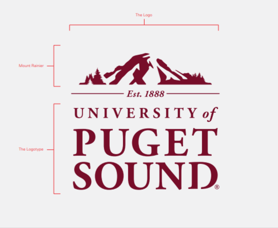
Elements of the primary university logo

Using the Primary Logo

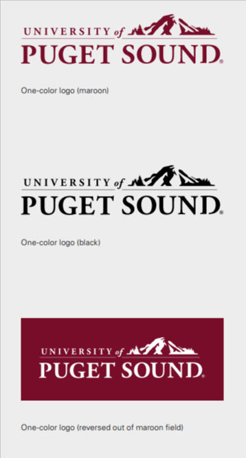
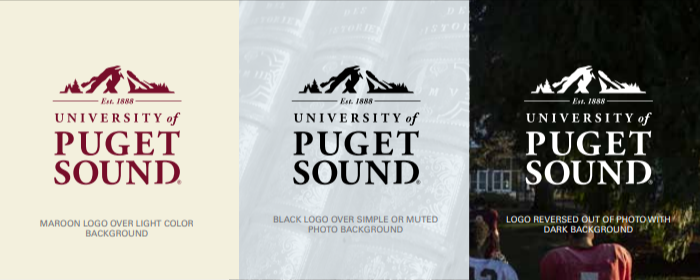
Acceptable logo colors

The primary Puget Sound logo serves as the main graphic representation of the university. It is the primary identifier for Puget Sound. It should be used on all materials and supersedes the use of all other logos. 

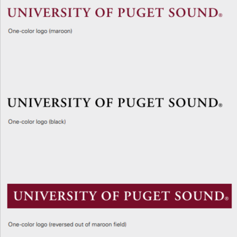
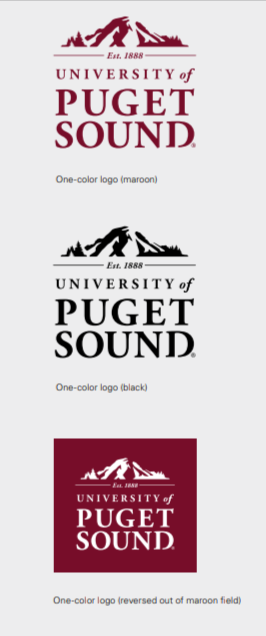
The primary logo may be used in black, maroon, and reversed out of a maroon field, shown at right, or dark backgrounds and photos; approved art is available by contacting the Office of Marketing & Communications. 

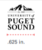
The primary logo should never be shown smaller than 5/8 in (.625 in.) wide. See Minimum Size below for graphics to use in small situations.

Smallest allowed logo sizing

Using the Secondary Logo

Secondary logo allowed colors

The secondary logo is an adapted version of the primary logo keeping the characteristics of the primary logo’s custom typography and use of the mountain, but it does not incorporate the founding date, “Est. 1888.” The secondary logo should be used only in cases when there is not space for the primary logo at its minimum size of .625 in. and when the application (embroidery, for example) is not refined enough to accommodate the “Est. 1888” design element. 

The secondary logo may be used in black, maroon, or reversed out of a maroon field, shown at right, or dark backgrounds and photos; approved art is available by contacting Office of Marketing & Communications. 

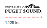
The secondary logo should never be shown smaller than 1-1/8 in. (.1.125 in.) wide. See Minimum Size below for graphics to use in small situations.

Smallest allowed use of the secondary logo

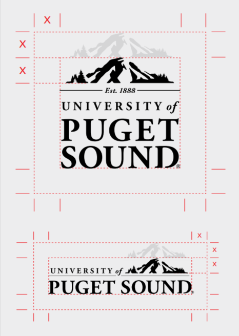
To display the logo correctly, maintain the proper minimum clear space. This minimum clear space is equal to the height of the mountain depicted in our Puget Sound logo. No other image or text should appear within the designated clear space.

required clear space around logo

The primary logo should never be smaller than 5/8 in. (.625 in.) wide. 

The secondary logo should never be smaller than 1 1/8 in. (1.125 in.) wide. 

Type Treatment: If it is not possible to use the logo, even at minimum size, it is acceptable to type the college name as shown here. A digital file is available on request. The general specificatons are: 

  • Adobe Garamond Semibold 
  • Tracking of 50 
  • All Caps 
  • Black, Pantone® 188 or reversed on colored backgrounds
  • Minimum font size of 7.5 point
Type treatment for smaller spaces

A master identity system that consistently incorporates the primary logo with department or division names, known as a logo lockup, is how we establish consistent visibility. This is the only way a department or division should represent itself. 

Department names in logo lockups should be set in Univers 55 Roman in uppercase and lowercase to the right of the primary logo and should be set apart from the logo by a .5-point vertical rule.

Sample departmental lockups using the primary logo

If a department or group name has one to three words, the name may appear below the primary logo in an alternate logo lockup. Set the department or group name in Univers 55 Roman in uppercase and lowercase, set apart from the logo with a .5-point horizontal rule. 

In some cases, space or application won’t allow for use of the primary logo. For those instances, use the secondary logo lockup, with the department or group name set in Univers 55 Roman in uppercase and lowercase below the logo, set off by a .5-point horizontal rule.

Alternate departmental lockups

Having contact information on all publications and platforms is essential for accessibility. All brochures, ads, booklets, and other publications should “sign off” (on a back cover, for example) with the Puget Sound logo in this way. (For email signatures, see page 42.) 

Standard type size generally follows the following specifications: Font: Univers 55 Roman Size: 8-11 points Leading: 14 point 

The minimum-size type treatment (see above) and the Puget Sound website are also acceptable content for a department signature. 

If needed, consult with the Office of Marketing & Communications to select the signature application that works best for your project.

Sample departmental signatures

Maroon Logo: The maroon logo may be used only on white backgrounds or neutral backgrounds that have values lighter than or equal to 10% black. 

Black Logo: The black version of the logo may be used on any uncluttered background with a value lighter than 30% black. 

Reversed Logo: Use the reversed logo on colored backgrounds or photos with a value of 60% black or more.

Logo backgrounds

Reinforcing our primary Puget Sound identity is the best way to keep from getting lost in the crowd. Within our brand system, it is rarely necessary to create new logos; in fact, there are many other ways to establish a distinctive look for a department or program within the established guidelines. 

New logos may be appropriate for special initiatives, such as fundraising campaigns. Requests for new logos should be made in consultation with the Office of Marketing & Communications and incorporate elements of Puget Sound’s brand identity system. 

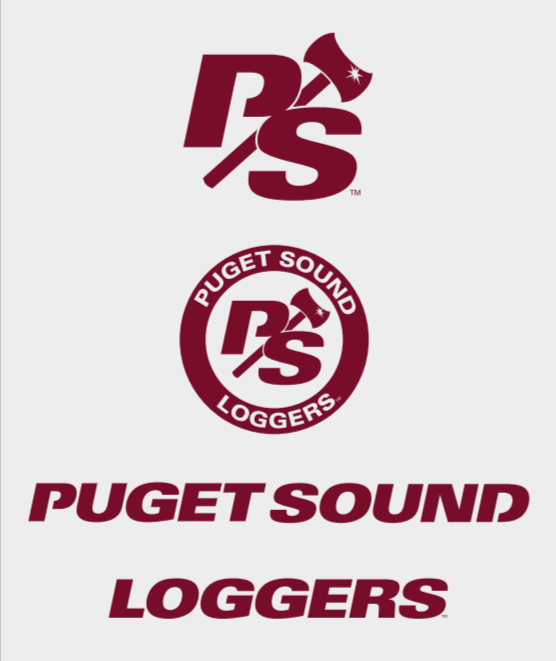
Approved logos may be used only by the departments/ programs for which they were created. See examples of approved logos below.

Puget Sound Athletics logos

Reinforcing our primary Puget Sound identity is the best way to keep from getting lost in the crowd. Within our brand system, it is rarely necessary to create new logos; in fact, there are many other ways to establish a distinctive look for a department or program within the established guidelines. 

New logos may be appropriate for special initiatives, such as fundraising campaigns. Requests for new logos should be made in consultation with the Office of Marketing & Communications and incorporate elements of Puget Sound’s brand identity system. 

Approved logos may be used only by the departments/ programs for which they were created. See examples of approved logos below.

Other approved university logos

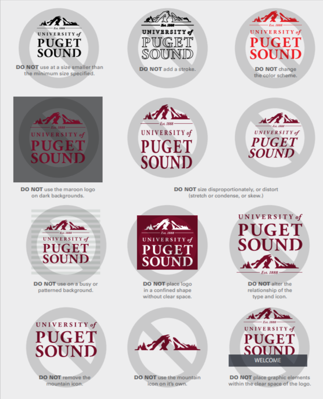
Incorrect Usage

The logo may not be altered in any way. For any reason. Ever! 

The following usage violations apply to both the primary and secondary logos.

Incorrect logo usage examples