In this section

This section includes our university seal and guidance for proper use.

University Seal

Acceptable colors for the university seal

The oldest graphic representation of University of Puget Sound, the seal is a sacred, time-honored, official mark of the college. It is not our logo. The Greek phrase near the top can be translated as “To the heights,” referencing both the central image of Mount Rainier and the attributes of Puget Sound’s physical location and dynamic culture. 

The seal is intended for use on official, formal, institutional documents, such as those from the Office of President and related to Commencement, including acceptance certificates and diplomas. 

The seal should never be used as an alternative to the logo, and it should never appear in conjunction with the logo. 

The seal may appear in black, maroon, gold (Pantone® 871), or gold foil.
 

Using the Seal: Minimum Clear Space

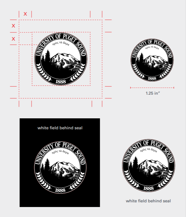
Minimum size and clear space around university seal

The seal should never be smaller than five-fourths inch (5/4 in.), and should always have at least one-quarter inch (1/4 in.) of clear space surrounding it. 

The seal may be used on any background that is light or dark enough to provide sufficient contrast. The seal’s colors should never be reversed. If the seal appears on a dark background, a white field should appear behind the seal as shown at right.

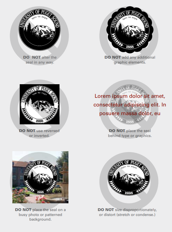
Incorrect Usage

Incorrect seal usage examples

The seal may not be altered in any way. 

  • Do not add any additional graphic elements. 
  • Do not use reversed or inverted. 
  • Do not place the seal behind type or graphics. 
  • Do not place graphic elements within the 1/4 in. clear space of the seal. 
  • Do not use smaller than 5/4 in. in diameter. 
  • Do not place the seal on a busy photo or patterned background. 
  • Do not size disproportionately or distort (stretch or condense).