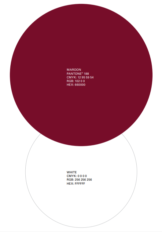
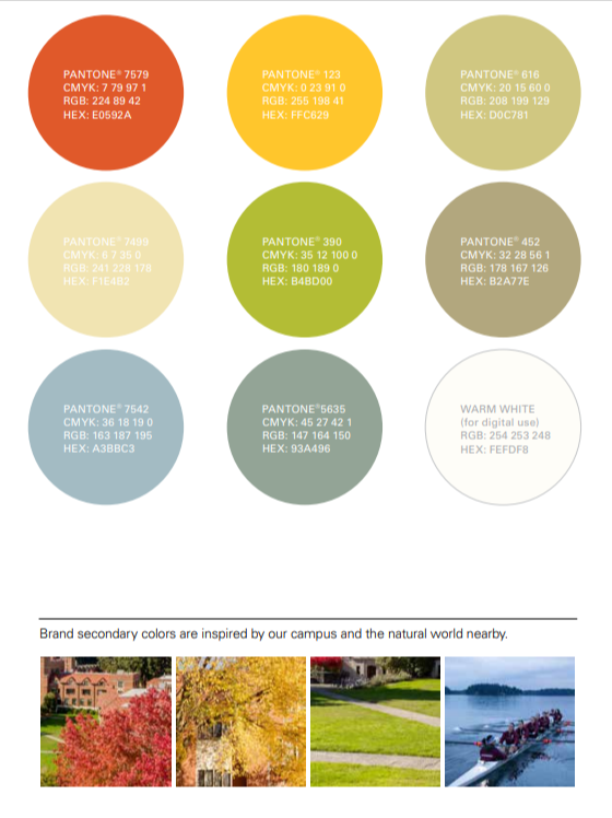
The secondary color palette adds flexibility and variety to the primary brand colors. You can use this palette throughout branded communications to highlight, complement, and accent the primary colors. The secondary colors can also add intensity or create subtlety, depending on the application.
Puget Sound secondary colors are inspired by the warm tones of brick and stone used on our campus buildings, the blues, greens, and neutrals are inspired by the natural beauty of our location next to the Salish Sea.
Reproduce brand colors in Pantone® spot colors or CMYK when available. Use CMYK values for digital printing and RGB and HEX values for all screen-based applications. You can also use specialty printing techniques, such as UV varnishes and foils. If you do so, please reference the current edition of Pantone® Color Publications to ensure the closest color match possible.
For a period of time Puget Sound’s brand colors were green and gold. To honor those alumni who were here during those years we occasionally use the green and gold colors below in very specific communications.
Rich black versus basic black for printing