In this section

This section defines some samples of University of Puget Sound icons, shapes, and textures used in marketing communication pieces.

Brand Art & Textures

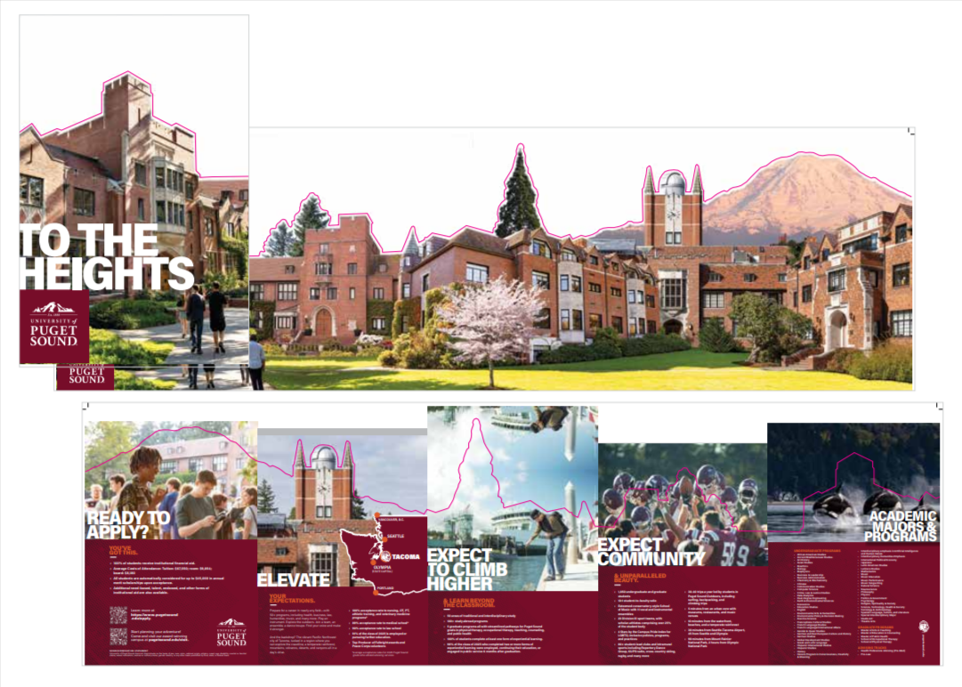
Puget Sound’s brand art and textures reflect our location in the Pacific Northwest, featuring elements such as water, trees, and mountains. They also incorporate aspects of our campus, like the giant sequoia, and make reference to our aspirations as an institution. Our brand art includes natural textures, such as wood grain, as well as hand-crafted textures like woodcuts and sketches.
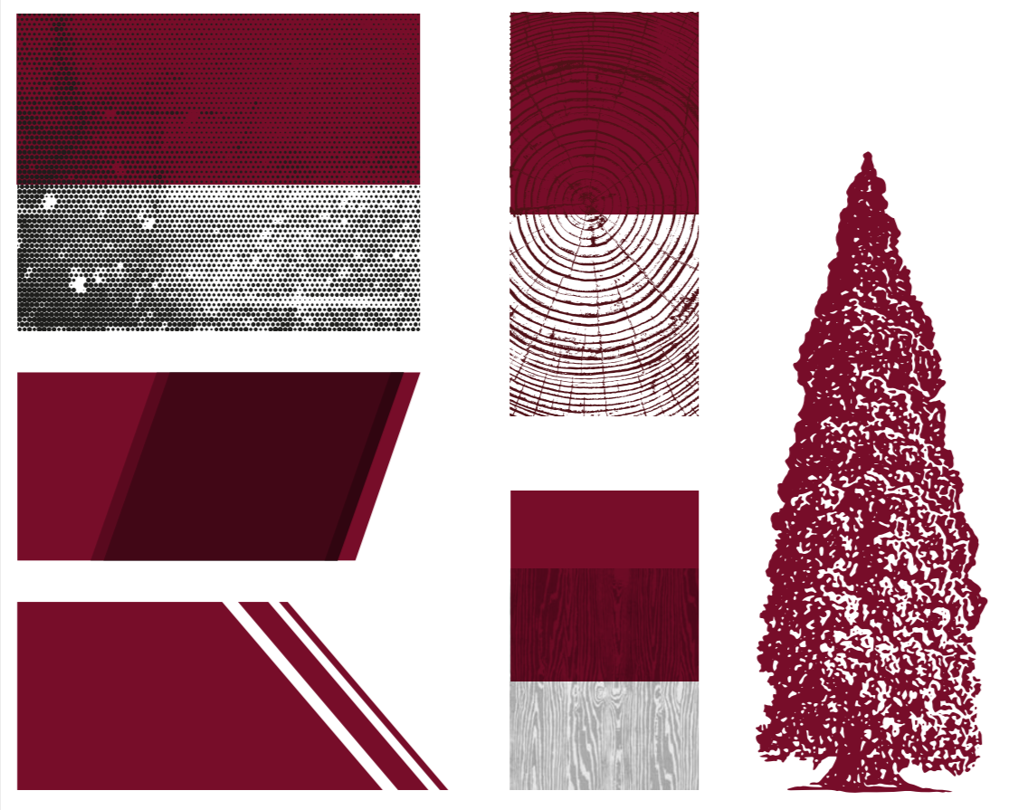
Brand art and texture examples

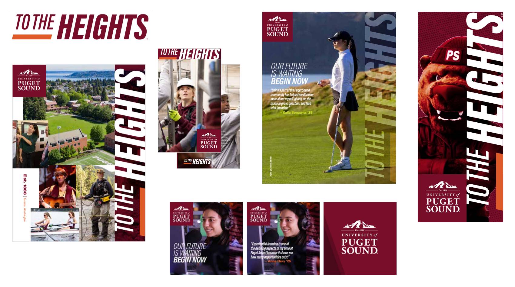
To the Heights (classic brand tactic examples)

Brand art should complement the other graphic elements of our brand, including strong photography, clear typography, and proper use of our logo.

To the heights branding examples

Enrollment Marketing (tactic examples)

Brand art should complement the other graphic elements of our brand, including strong photography, clear typography, and proper use of our logo.

Enrollment cut out piece
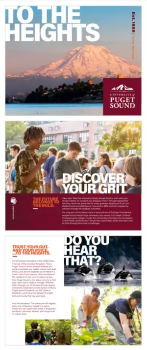
Enrollment marketing example

Greater, We Ascend (campaign)

Brand art should complement the other graphic elements of our brand, including strong photography, clear typography, and proper use of our logo.

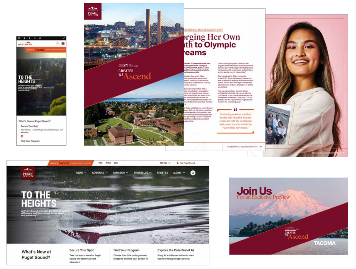
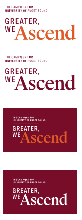
Greater, We Ascend campaign branding examples